R for Data Science
Make sure to select R kernel in JupyterLab in order to run this notebook (Kernel -> Change Kernel ... -> R).
If you cannot find the R kernel in your JupyterLab, see this following link to install it.
https://richpauloo.github.io/2018-05-16-Installing-the-R-kernel-in-Jupyter-Lab/
For reproducibility, we display the system information.
sessionInfo()
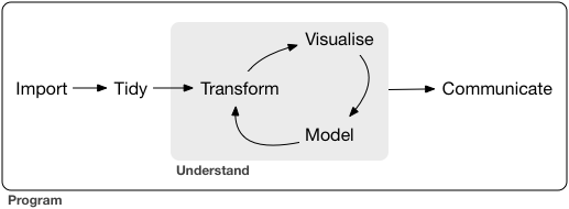
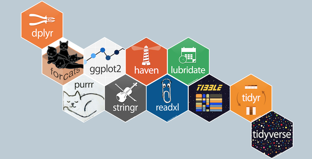
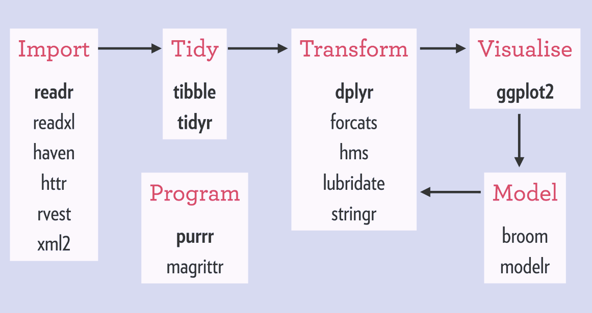
tidyverse
- tidyverse is a collection of R packages for data ingestion, wrangling, and visualization.
- The lead developer Hadley Wickham won the 2019 COPSS Presidents’ Award (the Nobel Prize of Statistics)
for influential work in statistical computing, visualization, graphics, and data analysis; for developing and implementing an impressively comprehensive computational infrastructure for data analysis through R software; for making statistical thinking and computing accessible to large audience; and for enhancing an appreciation for the important role of statistics among data scientists.
- Install the tidyverse ecosystem by
install.packages("tidyverse"). You don't need to install on the server since it's already installed there.
# load the tidyverse ecosystem
library(tidyverse)
Inspect MIMIC data files
# getwd() to check the current working directory, setwd() to change it
# path to the MIMIC data
if (Sys.info()["nodename"] == "RELMDOMFAC30610") {
    # DOMStat laptop
    mimic_path <-  "/Users/huazhou/Desktop/mimic-iv-1.0"
} else if (Sys.info()["user"] == "jovyan") {
    # workshop server
    mimic_path <- "/home/shared/1.0"
}
mimic_path
MIMIC directory structure
We run the Bash command tree -s -L 2 /Users/huazhou/Documents/Box Sync/MIMIC/mimic-iv-1.0 to display the MIMIC directory structure. The number in front of each data file indicates its file size (in bytes).
# tree -s -L 2 /Users/huazhou/Documents/Box\ Sync/MIMIC/mimic-iv-1.0
# only work on system (Linux or MacOS) with `tree` command installed
cat(system(str_c("tree -s -L 2 ", shQuote(mimic_path)), intern = TRUE), sep = '\n')
Data files (csv.gz) are grouped under three directories; core, hosp, and icu.
Most relevant to this tutorial are icustays.csv.gz, admissions.csv.gz, patients.csv.gz, and chartevents.csv.gz. Let's first peek into the content of each file, by calling Bash commands within R. Before that, we introduce the pipe, which is heavily used in this tutorial.
Pipe
Pipe linearizes nested function calls and makes complex code more readable. It enables cleaner code by.
- structuring sequences of data operations left-to-right (as opposed to from the inside and out),
- avoiding nested function calls,
- minimizing the need for local variables and function definitions, and
- making it easy to add steps anywhere in the sequence of operations.
Pipe exists in many languages: Linux (|, >, <, >>), R (%>% implemented in the magrittr package in tidyverse), and Julia (|>).
For example, the following nested code calls three R functions in sequence: (i) str_c function to construct proper Bash command (a string) to run, (ii) system function to run the Bash command, and (iii) cat function to properly break lines in the Bash command output.
cat(system(str_c("zcat < ", shQuote(str_c(mimic_path, "/icu/icustays.csv.gz")), " | head"), intern = TRUE), sep = `\n`)
Using pipe %>%, the following code achieves the same purpose
str_c("zcat < ", shQuote(str_c(mimic_path, "/icu/icustays.csv.gz")), " | head") %>%
    system(intern = TRUE) %>%
    cat(sep = '\n')
icustays.csv.gz
Each row is an ICU stay. One patient can have multiple ICU stays during one hospital admission.
str_c("zcat < ", shQuote(str_c(mimic_path, "/icu/icustays.csv.gz")), " | head") %>%
    system(intern = TRUE) %>%
    cat(sep = '\n')
admissions.csv.gz
Each row is a hospital admission. One patient can be admitted multiple times.
str_c("zcat < ", shQuote(str_c(mimic_path, "/core/admissions.csv.gz")), " | head") %>%
    system(intern = TRUE) %>%
    cat(sep = '\n')
patients.csv.gz
Each row is a unique patient.
str_c("zcat < ", shQuote(str_c(mimic_path, "/core/patients.csv.gz")), " | head") %>%
    system(intern = TRUE) %>%
    cat(sep = '\n')
chartevents.csv.gz
Each row is a specific vital reading during an ICU stay.
str_c("zcat < ", shQuote(str_c(mimic_path, "/icu/chartevents_filtered_itemid.csv.gz")), " | head") %>%
    system(intern = TRUE) %>%
    cat(sep = '\n')
Dictionary for itemid is provided by the d_items.csv.gz file.
str_c("zcat < ", shQuote(str_c(mimic_path, "/icu/d_items.csv.gz")), " | head") %>%
    system(intern = TRUE) %>%
    cat(sep = '\n')
In this tutorial, let's just focus on the following vitals:
220045for heart rate223761for Temperature Fahrenheit
select_chart_itemid <- c(220045,223761)
select_chart_itemid
Ingest data as tibbles
tibbles (from tidyverse) are enhanced dataframes from R.
read_csv function is the main engine in readr package for importing csv files.
read_csvhandles the gz files seamlessly.read_csvparses the column data types based on the first batch of rows (guess_maxargument, default 1000). Most times it guesses the column data type right. If not, use thecol_typesargument to explicitly specify column tpyes. Use?read_csvto see details.
icustays_tbl
icustays_tbl <-
    read_csv(str_c(mimic_path, "/icu/icustays.csv.gz")) %>%
    print(width = Inf)
admissions_tbl
admissions_tbl <-
  read_csv(str_c(mimic_path, "/core/admissions.csv.gz")) %>%
  print(width = Inf)
patients_tbl
patients_tbl <-
    read_csv(str_c(mimic_path, "/core/patients.csv.gz")) %>%
    print(width = Inf)
chartevents_tbl
chartevents.csv.gz is a gzipped file of size 2.36GB (329,499,788 rows). Can we even read it?
Reading in the chartevents.csv.gz turns out to be challenging. The following code reads only 4 columns
chartevents_tbl <-
    read_csv(
        str_c(mimic_path, "/icu/chartevents.csv.gz"),
        col_select = c(stay_id, itemid, charttime, valuenum),
        col_types = cols_only(
            stay_id = col_double(),
            itemid = col_double(),
            charttime = col_datetime(),
            valuenum = col_double()
        )
    )
and took >10 minutes to run on my computer (Intel i7-6920HQ CPU @ 2.90GHz, 16GB RAM). Please do NOT try to run it on the server. The main constraint is memory size. read_csv is designed to read the whole dataset into memory, and struggles if the data size is bigger than memory. One solution to this data volume issue is database, which we will briefly mention later.
For this tutorial, we prepared a smaller chart event data file chartevents_filtered_itemid.csv.gz, which only contains the chart items we are interested in:
220045for heart rate223761for Temperature Fahrenheit
On my computer, it takes around 15 seconds to ingest this reduced data file.
# ingest the reduced chart event data
system.time(
chartevents_tbl <-
    read_csv(
        str_c(mimic_path, "/icu/chartevents_filtered_itemid.csv.gz"),
        col_types = cols_only(
            stay_id = col_double(),
            itemid = col_double(),
            charttime = col_datetime(),
            valuenum = col_double()
        )
    ) %>%
    print(width = Inf)
)
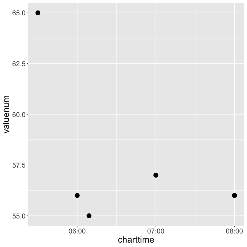
# heart rate readings for a specific stay
# try add colour = charttime, shape = factor(charttime) in geom_point(aes())
chartevents_tbl %>%
    filter(stay_id == 30600691, itemid == 220045) %>%
    print(width = Inf) %>%
    ggplot() +
        geom_point(mapping = aes(x = charttime, y = valuenum), size=4)+
         theme(axis.title.x = element_text(size = 18),
               axis.text.x = element_text(size = 14),
               axis.title.y = element_text(size = 18),
               axis.text.y = element_text(size = 14))
Target cohort
We aim to develop a predictive model, which computes the chance of dying within 30 days of ICU stay intime based on baseline features
first_careunitageatintimegenderethnicity- first measurement of the following vitals since ICU stay
intime- 220045 for heart rate
- 223761 for Temperature Fahrenheit
We restrict to the first ICU stays of each unique patient.
Wrangling and merging tibbles
Our stragegy is
Identify and keep the first ICU stay of each patient.
Identify and keep the first vital measurements during the first ICU stay of each patient.
Join four tibbles into a single tibble.
Important data wrangling concepts: group_by, arrange, slice, joins, and pivot.
Step 1: restrict to the first ICU stay of each patient
icustays_tbl has 76,540 rows, which is reduced to 53,150 unique ICU stays.
See reference links for related concepts:
https://dplyr.tidyverse.org/reference/group_by.html
icustays_tbl_1ststay <-
    icustays_tbl %>%
    # first ICU stay of each unique `subject_id`
    group_by(subject_id) %>%
#     slice_min(intime) %>% # this function takes LONG
#     slice_max(n = 1, order_by = desc(intime)) %>% # this faster, but still lower than below
    arrange(intime, .by_group = TRUE) %>%
    slice_head(n = 1) %>%
    ungroup() %>%
    print(width = Inf)
Step 2: restrict to the first vital measurements during the ICU stay
Key data wrangling concepts: select, left_join, right_join, group_by, arrange, pivot
See reference links for related concepts:
https://dplyr.tidyverse.org/reference/select.html
# Be patient here. It takes some time (~30 seconds)
chartevents_tbl_1ststay <-
    chartevents_tbl %>%
    # pull in the intime/outtime of each ICU stay
    right_join(select(icustays_tbl_1ststay, stay_id, intime, outtime), by = c("stay_id")) %>%
    # only keep items during this ICU intime
    filter(charttime >= intime & charttime <= outtime) %>%
    # group by itemid
    group_by(stay_id, itemid) %>%
    # only keep the first chartime for each item
    # slice_min(charttime, n = 1) %>% # this function takes forever
    # top_n(-1, charttime) %>% # this function takes forever
    arrange(charttime, .by_group = TRUE) %>%
    slice_head(n = 1) %>%
    # do not need charttime and intime anymore
    select(-charttime, -intime, -outtime) %>%
    ungroup() %>%
    pivot_wider(names_from = itemid, values_from = valuenum) %>%
    # more informative column names
    rename(
        heart_rate = `220045`,
        temp_f = `223761`
    ) %>%
    print(width = Inf)
Step 3: merge tibbles
New data wrangling concept: mutate.
See the reference link here: https://dplyr.tidyverse.org/reference/mutate.html
mimic_icu_cohort <-
    icustays_tbl_1ststay %>%
    # merge tibbles
    left_join(admissions_tbl, by = c("subject_id", "hadm_id")) %>%
    left_join(patients_tbl, by = c("subject_id")) %>%
    left_join(chartevents_tbl_1ststay, by = c("stay_id")) %>%
    # age_intime is the age at ICU stay intime
    mutate(age_intime = anchor_age + lubridate::year(intime) - anchor_year) %>%
    # whether the patient died within 30 days of ICU stay intime
    mutate(hadm_to_death = ifelse(is.na(deathtime), Inf, deathtime - intime)) %>%
    mutate(thirty_day_mort = hadm_to_death <= 2592000) %>%
    print(width = Inf)
Data visualization
It is always a good idea to visualize data as much as possible before any statistical analysis.
Remember we want to model:
thirty_day_mort ~ first_careunit + age_intime + gender + ethnicity + heart_rate + temp_f
Let's start with a numerical summary of variables of interest.
mimic_icu_cohort %>%
    select(
        first_careunit,
        gender,
        ethnicity,
        age_intime,
        heart_rate,
        temp_f
    ) %>%
    # convert strings to factor for more interpretable summaries
    mutate_if(is.character, as.factor) %>%
    summary()
Do you spot anything unusual?
Consider the practical meaning when you analyze real data sets.
Univariate summaries
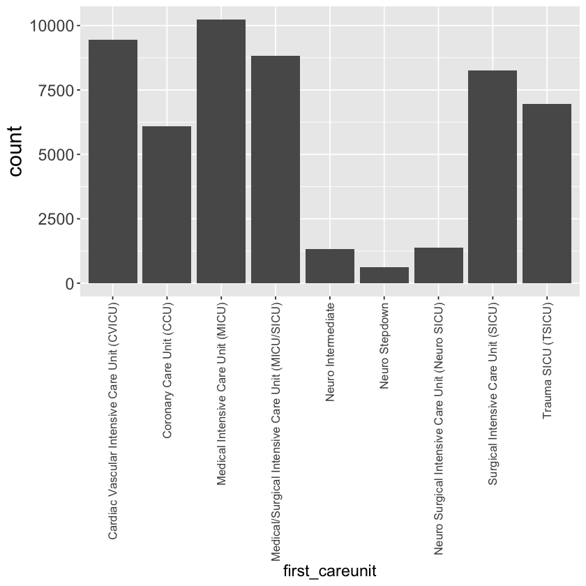
Bar plot of first_careunit
Set your own theme to make your plots look good to you.
mimic_icu_cohort %>%
    ggplot() +
    geom_bar(mapping = aes(x = first_careunit)) +
    theme(axis.text.x = element_text(angle = 90, vjust = 0.5, hjust=1, size=10),
         axis.title.x = element_text(size = 14),
         axis.title.y = element_text(size = 18),
         axis.text.y = element_text(size = 14))
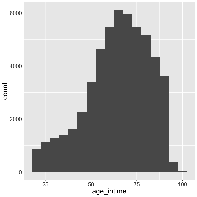
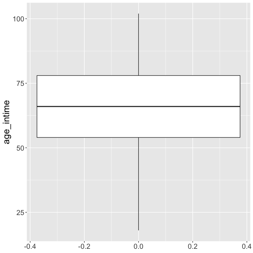
Histogram and boxplot of age_at_intime
mimic_icu_cohort %>%
    ggplot() +
    geom_histogram(mapping = aes(x = age_intime), binwidth = 5)+
             theme(axis.title.x = element_text(size = 18),
                   axis.text.x = element_text(size = 14),
                   axis.title.y = element_text(size = 18),
                   axis.text.y = element_text(size = 14))
mimic_icu_cohort %>%
    ggplot() +
    geom_boxplot(mapping = aes(y = age_intime))+
    theme(axis.title.x = element_text(size = 18),
                   axis.text.x = element_text(size = 14),
                   axis.title.y = element_text(size = 18),
                   axis.text.y = element_text(size = 14))
Exercises
- Summarize discrete variables:
gender,ethnicity. - Summarize continuous variables:
heart_rate,temp_f. - Is there anything unusual about
temp_f?
Bivariate summaries
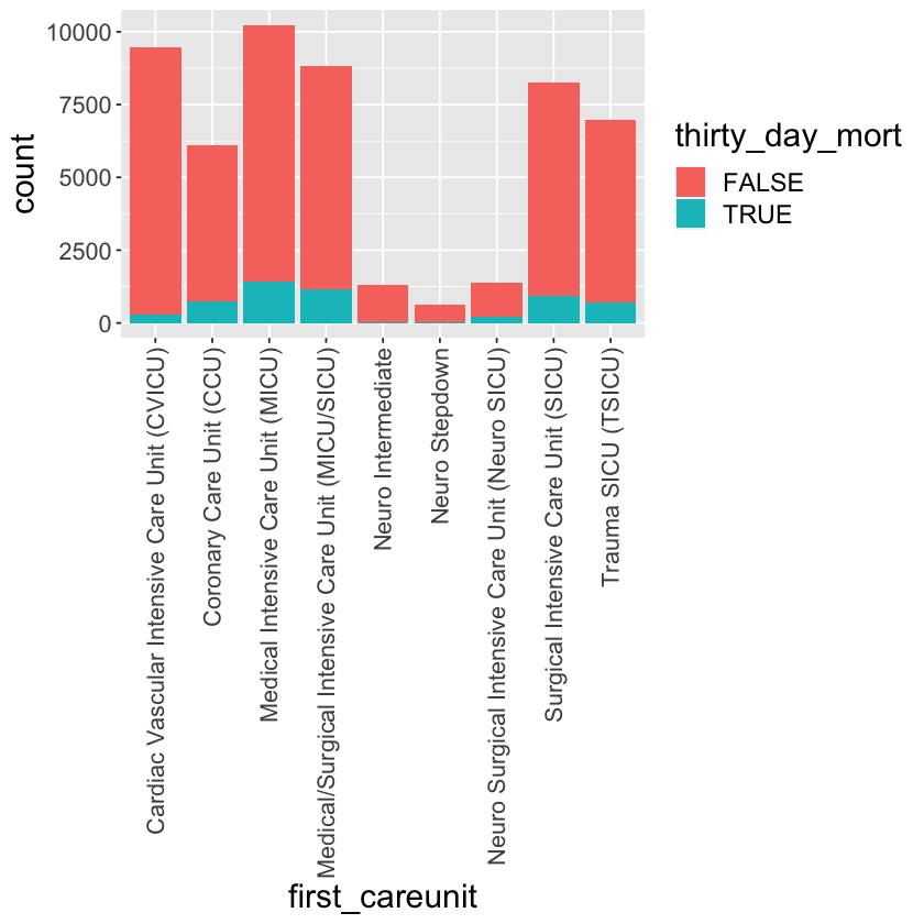
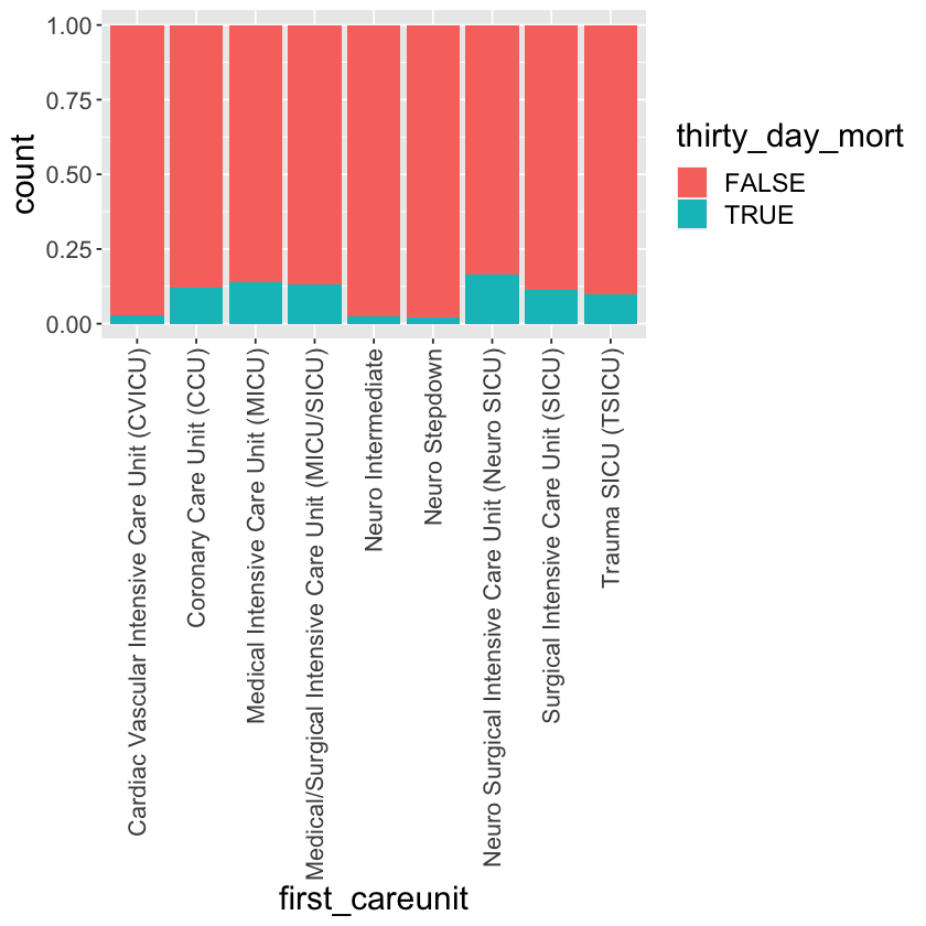
Tally of thirty_day_mort vs first_careunit.
mimic_icu_cohort %>%
  ggplot() +
  geom_bar(mapping = aes(x = first_careunit, fill = thirty_day_mort)) +
  theme(axis.text.x = element_text(angle = 90, vjust = 0.5, hjust=1, size=13),
        axis.title.x = element_text(size = 18),
        axis.title.y = element_text(size = 18),
        axis.text.y = element_text(size = 13),
        legend.title=element_text(size=18),
        legend.text=element_text(size=14))
mimic_icu_cohort %>%
  ggplot() +
  geom_bar(mapping = aes(x = first_careunit, fill = thirty_day_mort), position = "fill") +
  theme(axis.text.x = element_text(angle = 90, vjust = 0.5, hjust=1, size=13),
        axis.title.x = element_text(size = 18),
        axis.title.y = element_text(size = 18),
        axis.text.y = element_text(size = 13),
        legend.title=element_text(size=18),
        legend.text=element_text(size=14))
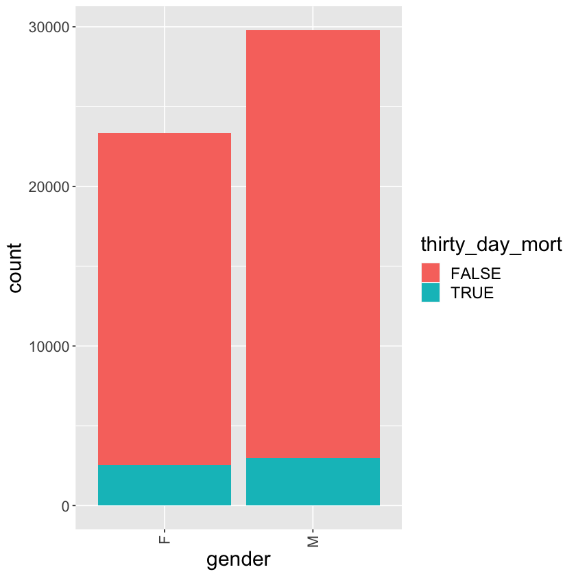
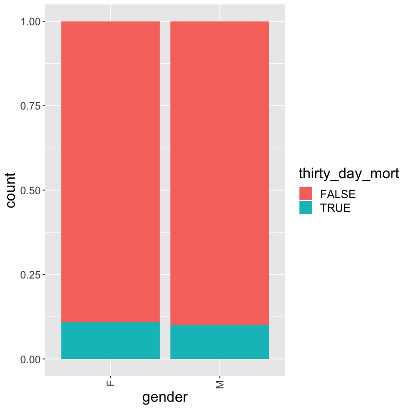
Tally of thirty_day_mort vs gender
mimic_icu_cohort %>%
  ggplot() +
  geom_bar(mapping = aes(x = gender, fill = thirty_day_mort)) +
  theme(axis.text.x = element_text(angle = 90, vjust = 0.5, hjust=1, size=13),
        axis.title.x = element_text(size = 18),
        axis.title.y = element_text(size = 18),
        axis.text.y = element_text(size = 13),
        legend.title=element_text(size=18),
        legend.text=element_text(size=14))
mimic_icu_cohort %>%
  ggplot() +
  geom_bar(mapping = aes(x = gender, fill = thirty_day_mort), position = "fill") +
  theme(axis.text.x = element_text(angle = 90, vjust = 0.5, hjust=1, size=13),
       axis.title.x = element_text(size = 18),
        axis.title.y = element_text(size = 18),
        axis.text.y = element_text(size = 13),
        legend.title=element_text(size=18),
        legend.text=element_text(size=14))
Exercises
- Graphical summaries of
thirty_day_mortvs other predictors.
Data quality control (QC) and imputation (self study)
Necessary steps before any analytics include
- exclude samples and variables with many missing values
- fix data entry errors, e.g.,
temp_f - impute missing values
Data analytics (self study)
tidymodels is an ecosystem for:
build and fit a model.
beature engineering: coding qualitative predictors, transformation of predictors (e.g., log), extracting key features from raw variables (e.g., getting the day of the week out of a date variable), interaction terms, etc.
evaluate model using with resampling.
tuning model parameters.
Database - revisiting chartevents.csv.gz
Recall that we had trouble ingesting the chartevents.csv.gz (2.36GB gzipped file, 329,499,788 rows) by read_csv. The solution is database. Set up Google BigQuery and demonstrate wrangling the chartevents data.
- What is Google BigQuery? https://www.youtube.com/watch?v=d3MDxC_iuaw&ab_channel=GoogleCloudTech
- Google BigQuery tutorial? https://www.youtube.com/watch?v=MH5M2Crn6Ag&ab_channel=MeasureSchool
Pros and Cons of R
Pros:
1) An open-source language: no need for a license or a fee.
2) A platform-independent language: run easily on Windows, Linux, and Mac.
3) Exemplary support for data wrangling and visiualization.
4) A language of statistics.
Cons
1) Data handling: data stored in physical memory.
2) Slow speed.